
- Introduction
- Why the Spotify Color Palette Stands Out
- The Spotify Color Palette Breakdown
- How to Use the Spotify Color Palette for Stunning and Cohesive Visuals
- Practical Ways to Apply the Spotify Color Palette
- Tools to Work with Spotify’s Color Palette
- These tools can make working with the Spotify palette faster and easier:
- Mistakes to Avoid When Using the Spotify Color Palette
- Why Cohesion is Key
- Conclusion
- FAQs
Introduction
When you think of Spotify, what comes to mind? Sleek black, vibrant green, and bold visuals that stand out anywhere.That’s the beauty of Spotify’s color palette — bold, simple, and unforgettable.
. If you’ve ever wondered how to use the Spotify color palette for stunning and cohesive visuals, you’re in the right place.
Whether you’re a designer, marketer, or content creator, learning to work with Spotify’s signature colors can help you create visuals that are modern, eye-catching, and consistent. In this guide, we’ll explore the basics of the Spotify color palette, why it works so well, and how you can use it in your own projects.
Why the Spotify Color Palette Stands Out
Spotify’s design success is no accident. Its color palette has been carefully chosen to connect with users while standing out in the crowded digital space. Here’s why it works:
-
Vibrancy: Bright green against a dark background pops instantly.
-
Modern appeal: Minimalistic shades reflect a sleek, trendy brand.
-
Flexibility: The palette blends well with other neutral or bold colors.
-
Consistency: From the app to ads, the same colors build strong recognition.
Understanding this palette helps you maintain that same balance of vibrancy and cohesion in your visuals.
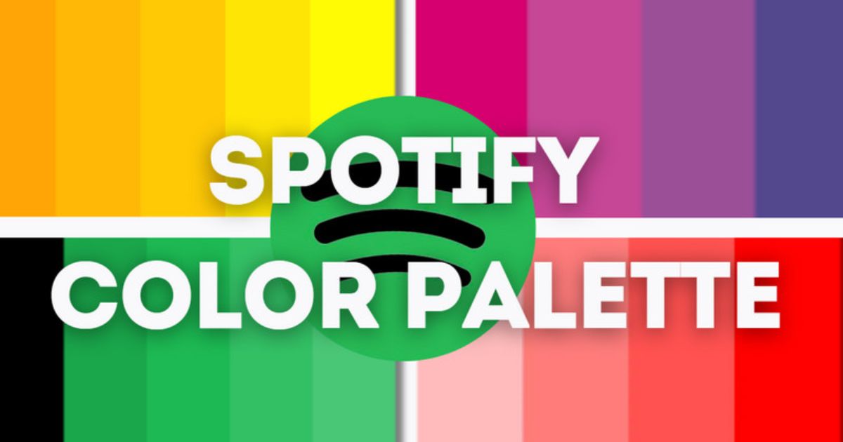
The Spotify Color Palette Breakdown
Here are the primary colors used in Spotify’s branding:
- Spotify Green (#1DB954) — a fresh, energetic hue that everyone recognizes as Spotify.
- Black:
#191414— a deep, sleek black perfect for contrast. - Spotify also uses secondary accent colors for campaigns and seasonal graphics, like:
-
Bright purples
-
Hot pinks
-
Electric blues
-
Sunshine yellows
These accents help keep the visuals dynamic without losing Spotify’s iconic feel.
How to Use the Spotify Color Palette for Stunning and Cohesive Visuals
1. Start with the Base Colors
Start your design with Spotify’s core trio: green, black, and white — the perfect base for a sleek and modern look.
-
Use Spotify green for highlights like buttons, logos, or key elements.
-
Keep black backgrounds to make other colors pop.
-
Use white for text or clean sections to balance the vibrancy.
2. Add Accent Colors for Creativity
To avoid monotony, bring in accent shades:
-
Add a bold purple or pink for a creative and trendy look.
-
Use blue or yellow for energy and freshness.
-
Limit accent colors to one or two per design to keep it cohesive.
-
Pro Tip: Always make sure the accent colors complement, not overpower, the main green.
3. Maintain Balance with Neutrals
The magic of the Spotify color palette is balance. Too much green can overwhelm the design, while too much black may make it look heavy.
For best results:
-
Use 60% neutral (black or white)
-
Add 30% Spotify green
-
Include 10% accent colors
This keeps your design clean while still being vibrant.
4. Pair Colors with Typography
Spotify pairs its color palette with modern sans-serif fonts for clarity and style.
When using these colors:
-
Use white or green text on darker backgrounds for clean, high-contrast visuals.
ackgrounds.
-
Use black text on lighter accent backgrounds.
-
Ensure your text has enough contrast for readability.
5. Use Gradients for a Modern Look
Gradients are a signature part of Spotify’s promotional materials. You can:
-
Combine Spotify green with purple for a futuristic vibe.
-
Use blue-to-pink gradients for playful, energetic designs.
-
Keep gradients subtle to avoid a cluttered look.
Practical Ways to Apply the Spotify Color Palette
For Social Media
Social platforms are all about standing out. Here’s how to use the palette effectively:
-
Highlight quotes or playlists with green borders.
-
Use black backgrounds for a bold, Spotify premium look.
-
Add accent gradients for a pop of personality.
For Websites or Apps
If you’re designing a Spotify-inspired site or app:
-
Make navigation bars black for a clean, modern feel.
-
Use green buttons for calls-to-action (like “Play” or “Subscribe”).
-
Balance with white space for a minimalistic vibe.
For Marketing Campaigns
Marketing visuals need to grab attention instantly.
-
Use high-contrast designs: black background + green highlights.
-
Incorporate bright accents to reflect the energy of music.
-
Keep your brand’s typography consistent for a professional finish.
Tools to Work with Spotify’s Color Palette
These tools can make working with the Spotify palette faster and easier:
Adobe Color: Generate harmonious palettes with Spotify’s green as the base.
-
Coolors.co: Quickly create custom color schemes.
-
Figma or Canva: Apply and preview the Spotify palette in real time.
Mistakes to Avoid When Using the Spotify Color Palette
-
Overloading with green: It should highlight, not dominate, your design.
-
Ignoring balance: Always keep neutrals in the mix.
-
Poor contrast: Ensure your text is easy to read on any background.
-
Random accent colors: Stick to shades that complement the base palette.
Why Cohesion is Key
The real power of knowing how to use the Spotify color palette for stunning and cohesive visuals lies in consistency. Every piece of content — from a social post to a website banner — should feel connected. Cohesion builds trust, professionalism, and brand recognition.
Conclusion
Mastering how to use the Spotify color palette for stunning and cohesive visuals is about more than picking pretty colors — it’s about creating a design system that’s vibrant, modern, and balanced. By using Spotify green strategically, adding accents wisely, and maintaining consistency, your visuals will pop while staying professional.
Start experimenting with these tips today. Open your design tool, apply Spotify’s signature shades, and create visuals that stand out while telling your story.
Are you ready to bring your projects to life with the Spotify color palette?
Jump in, start designing, and let your creativity take the spotlight!
FAQs
1. Can I mix other colors with the Spotify palette?
Absolutely! You can play around with accent shades like purple, pink, blue, or yellow. Just keep the mix balanced so the green still stands out as the hero color.
2. Why is Spotify Green so popular in design?
Spotify Green pops because it’s bright, fresh, and versatile. It grabs attention instantly while still looking sleek and professional.
3. How do I keep my designs looking cohesive?
Stick to the 60-30-10 rule — use about 60% black or white for the base, 30% Spotify Green for highlights, and 10% for accent colors. This keeps your design clean and balanced.
4. What tools can help me use the Spotify color palette?
Easy-to-use tools like Adobe Color, Coolors, Canva, or Figma make it simple to experiment and create polished visuals with Spotify’s colors.